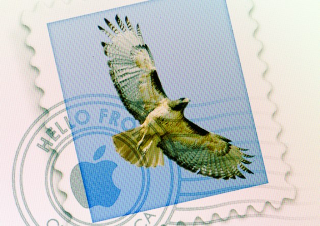
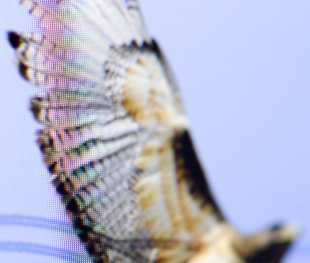
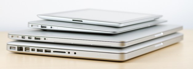
The other day, I noticed my Canon 7D with a 100mm macro lens on it sitting right beside my MacBook Pro with a Retina display, so I decided to see what 220 pixels per inch looks like blown up. The photographs below compare the same icons and text on a Retina display versus the display on an 11″ MacBook Air.
Click on any of the images to see it at twice the size (note that the images are 1,000 pixels wide and 220 PPI, so they look awesome on a retina display, but they may also take a few seconds to load).

The Mail.app icon on a retina display. If your monitor is clean and you look really closely, you can see a few dead pixels.

The menu bar on a retina display. Notice how the updated icons look great, and those that haven’t been updated yet look like crap. Unfortunately, this is what most of the internet looks like (with the exception of text, which looks great).


